
Client Goal:
Create a high-converting, user-friendly landing page to promote a natural sleep technique program named The 3:3 Insomnia Hack. The goal was to build trust, explain benefits clearly, and guide users toward a purchase or sign-up.
My Role:
UI/UX Designer – responsible for the complete landing page design from wireframes to final UI. I worked on structuring the content, user flow, design system, and visual appeal while maintaining accessibility and responsiveness.
Design a visually appealing landing page to attract sleep-deprived users.
Clearly communicate the benefits of the 3:3 Insomnia Hack.
Drive user action with a prominent CTA (Call To Action).
Ensure trust through testimonials, FAQs, and secure checkout process.
Optimize for both desktop and mobile devices.
I began with:
Competitor analysis of sleep therapy and wellness pages.
Understanding user psychology, how tired users behave online (they prefer simple, fast, reassuring content).
Content flow analysis to map the emotional journey from awareness → interest → trust → conversion.
I followed a clear narrative:
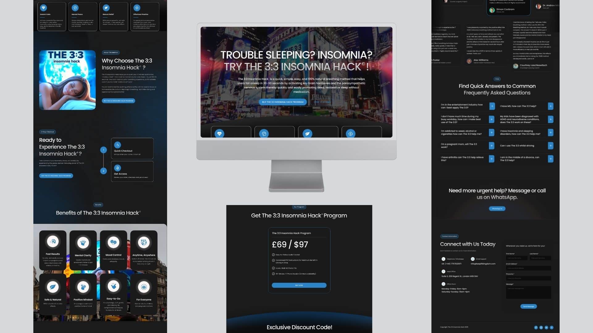
Hero Section – Addressed the user’s pain point: “Trouble Sleeping?”
How It Works – Step-by-step explanation with icons for clarity.
Why Choose Us? – Emphasized uniqueness and benefits.
Checkout Process – Simple and visually explained steps.
Benefits Section – Highlighted key outcomes.
Pricing & CTA – Strong pricing box with call-to-action.
Social Proof – Testimonials to build trust.
FAQs & Contact – Address objections and offer direct support.
Color Palette: Calm blues and dark tones for a restful, trustworthy feel.
Typography: Clear, modern sans-serif font with visual hierarchy.
Icons & Graphics: Custom icons for each feature for better engagement.
Images: Sleep-related imagery to connect emotionally with the user.
I created layouts for both desktop and mobile, ensuring:
Clear CTA visibility on all screen sizes.
Easy scroll navigation.
Optimized touch targets and content readability.
Conducted 2–3 rounds of internal reviews.
Adjusted button placements and copy tone for better clarity.
Improved image balance and text spacing after early feedback.
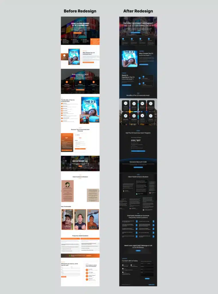
| Before | After |
|---|---|
| Cluttered layout, inconsistent spacing, orange-heavy styling | Balanced color palette, modern spacing, calming visual tone |
| Dense text with limited flow | Step-by-step storytelling for clarity |
| Generic visuals and inconsistent typography | Sleep-themed visuals, consistent fonts, and icon-based sections |
| Weak CTA structure | Clear CTAs placed strategically across the page |
A well-structured landing page can transform engagement and credibility
Emotional tone (color, language, image) plays a big role in wellness UX
Sticky CTAs and visual storytelling increase conversions significantly
Small UI adjustments (like content spacing and button hierarchy) make a massive difference in readability and trust
Final design delivered in Figma.
The landing page is conversion-focused, emotionally resonant, and user-friendly.
Client feedback was very positive with high user engagement reported post-launch.
Increased clarity through icon-based content.
Emotion-driven layout and CTA placement.
Trust-building through reviews, secure checkout visuals, and FAQs.
We help creative brands and startups turn bold ideas into powerful digital experiences that connect, engage, and inspire audiences worldwide
Quick chat, no pressure, just share your idea.