
Client: Dmarkify
A digital marketplace template provider offering clean, responsive layouts for portfolios, e-commerce, and landing pages.
Goal:
Design a strong visual identity that positions Dmarkify as a modern, trustworthy, and versatile tool for creatives and entrepreneurs.
Ensure a modern and clean aesthetic
Maintain flexibility with light and dark mode readiness
Competitors analyzed: other Shopify/Framer templates, portfolio platforms
Target users: freelancers, designers, small businesses needing customizable site templates
Gathered inspiration from minimalist tech brands and marketplace platforms
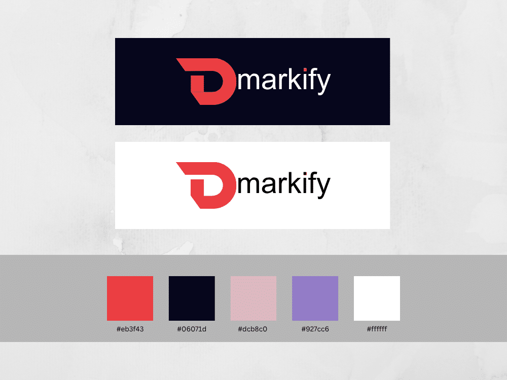
Brainstormed concepts around the letter “D” or monogram themes
Chose a refined “D”-mark with subtle curves to suggest flexibility and modern design
Combined the mark with clean sans-serif typography to keep the look professional yet approachable
Primary Color: Red (corporate-professional, Boldness, confidence, action)
Accent Color: Electric cyan (creative flair)
Neutral Colors: Light greys and white for flexibility in layouts
Usage: Accent used for CTAs and highlights, neutrals for backgrounds, primary for headers/logos
Headlines: Geometric sans-serif — modern, clean
Body Text: Humanist sans-serif — readable and friendly
Ensures strong contrast and legibility across screens
Icon set for features like “No-Code,” “SEO-Optimized,” “Shop Builder”
Pattern/shapes for backgrounds and section dividers
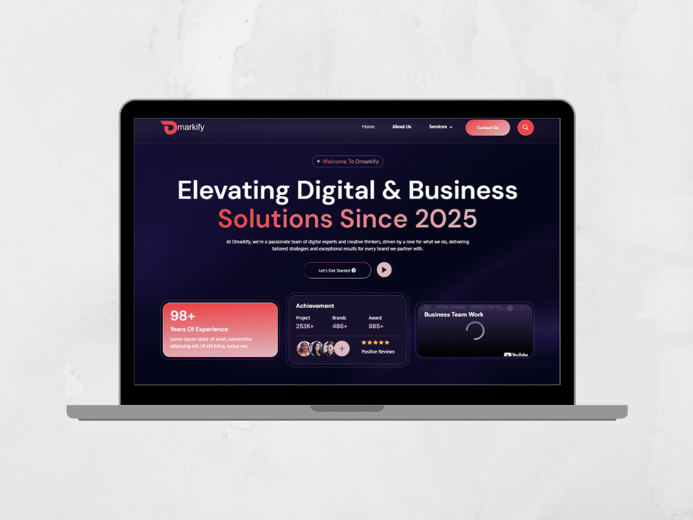
Marketing mockups: Hero banner with device frames, social post templates
Logo usage: Safe zone spacing, light/dark background versions
Color rules: Primary on white or dark backgrounds, accent sparingly
Typography rules: Font hierarchy explained across headers, subheaders, and paragraphs
Do’s & Don’ts: No distortions, always maintain aspect ratios
Delivered a comprehensive brand package in Figma + exported assets (SVGs, PNGs)
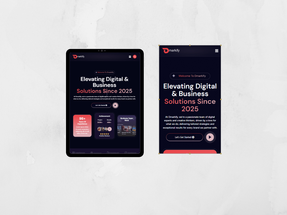
Designed responsive website, created hero banner mockups and social templates for quick launch
Client highly satisfied: “Our visuals now match our product quality”
Minimal adjustments in logo and colors greatly impact perceived brand quality
Clear, reusable visual rules streamline website and marketing design
Building for multiple layouts requires thoughtful neutral usage
Modern monogram logo with brand flexibility
Trust-building color scheme balanced with creative accent
Consistent assets & guidelines ready for product rollout
Brand Identity for Dmarkify
UI/UX Designer
1 Month
Figma, Illustrator
Design a strong visual identity that positions Dmarkify as a modern, trustworthy, and versatile tool for creatives and entrepreneurs.
We help creative brands and startups turn bold ideas into powerful digital experiences that connect, engage, and inspire audiences worldwide
Quick chat, no pressure, just share your idea.