

Client: Kula Tactical
Industry: Tactical Military Gear & Outdoor Equipment
Scope: Informational Page Design “About Us” and “Contact Us” pages to improve storytelling, credibility, and user engagement.
Build trust and transparency by visually narrating the brand’s story and values.
Simplify the contact process and encourage inquiries through a modern, intuitive UI.
Align visuals with the brand’s rugged and reliable identity.
UI/UX Designer: Responsible for page structure, layout, visual storytelling, and mobile responsiveness.
Designed both pages in Figma, with a focus on hierarchy, brand tone, and scannability.
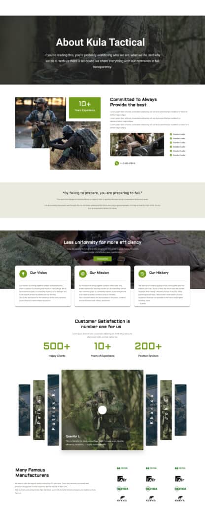
Hero Section with mission-led messaging: “About Kula Tactical”
Clear storytelling using:
Vision & Mission blocks
Quote integration (Benjamin Franklin)
Team and history section
Statistics (500+ happy clients, 10+ years of experience, etc.)
Customer reviews/testimonials
Color Palette: Military greens, black, white – emphasizing trust, authority, and ruggedness.
Typography: Strong display font for titles, clear sans-serif for readability.
Imagery: High-res tactical visuals to reflect the real-world use of products.
Iconography: Used for features like branded quality, history, and contact CTA.
All content is structured in digestible blocks with clear CTAs.
Scrollable and responsive with optimized text-to-image balance.
Testimonials carousel for social proof without clutter.
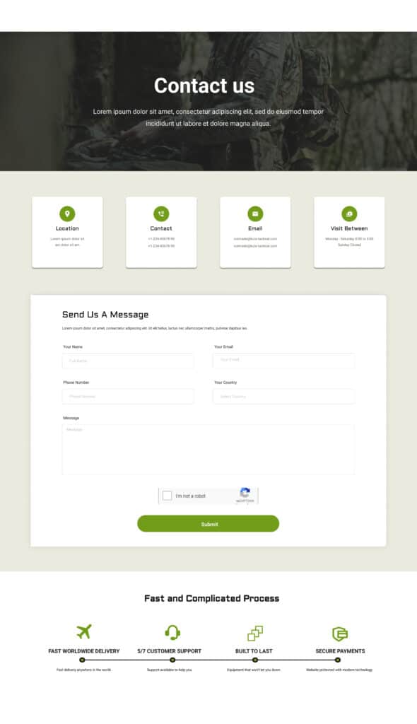
Designed for quick communication: Full Name, Email, Message
Optional: Phone/Inquiry Type dropdown for better filtering
Clean layout with military-inspired accent color for CTA (“Send Message”)
Integrated WhatsApp icon for instant support.
Support hours and email listed with icons for clarity.
Mobile-friendly spacing, large tap areas, and inline field validations.
Delivered both desktop and mobile versions in Figma.
The “About” page adds depth to the brand’s identity and boosts user confidence.
The “Contact” page simplifies user interaction and directs inquiries efficiently.
Client praised the clear structure and rugged aesthetic that aligns with their brand image.
Visual storytelling with strong military theme
Structured layout with modular components
Integrated testimonials and brand trust signals
Clean, responsive contact form with easy usability
We help creative brands and startups turn bold ideas into powerful digital experiences that connect, engage, and inspire audiences worldwide
Quick chat, no pressure, just share your idea.