Designers today rely on more than instinct, they need tools that guide creativity with purpose. Enter the color ring, a modern approach to choosing, combining, and applying colors across digital interfaces.
The Evolving Role of Color in Digital Design
Digital design isn’t static. With light/dark modes, system preferences, and responsive layouts, color has to be dynamic and adaptable. Traditional swatches no longer cut it.
Introducing the Concept of Color Rings
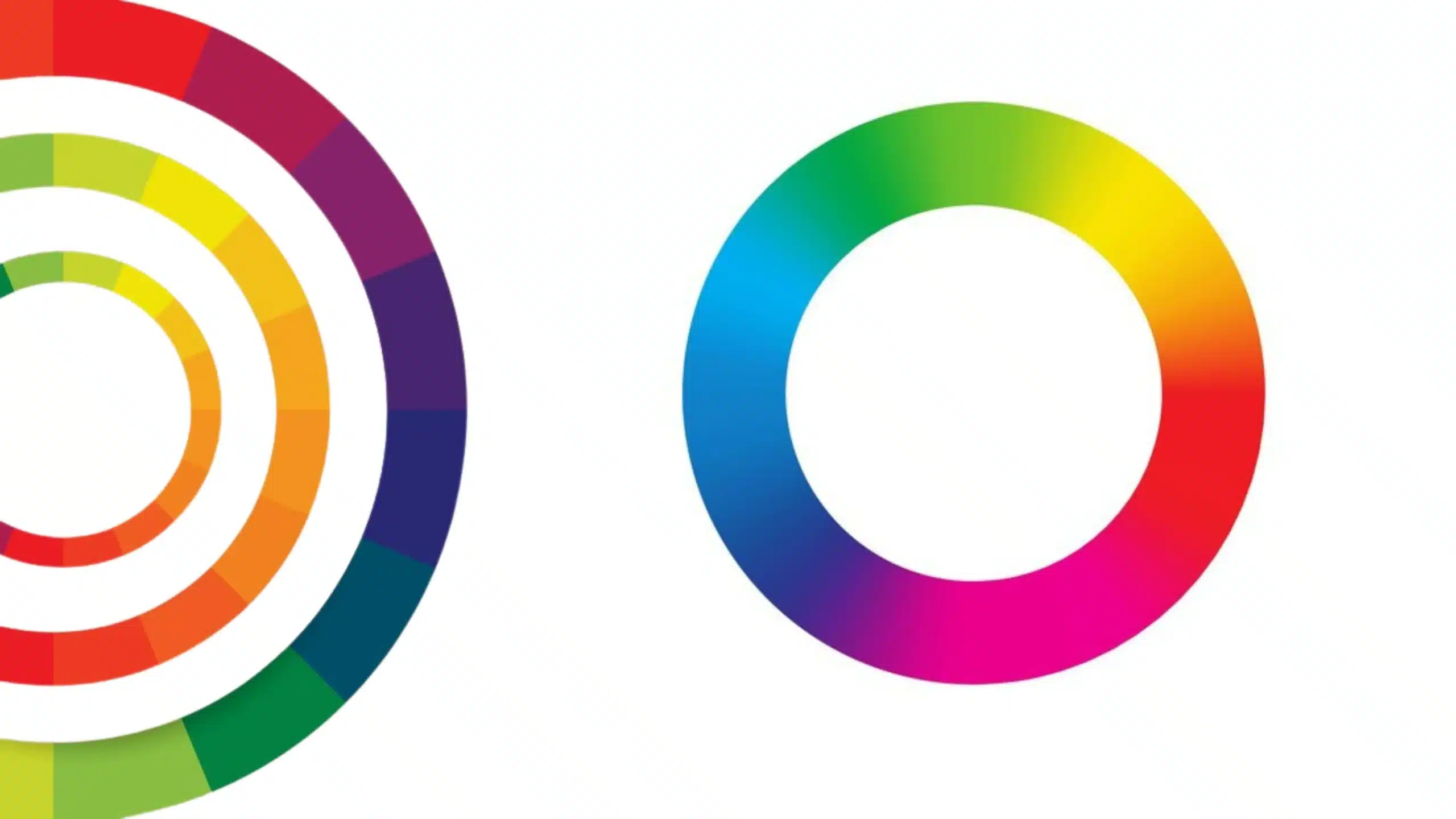
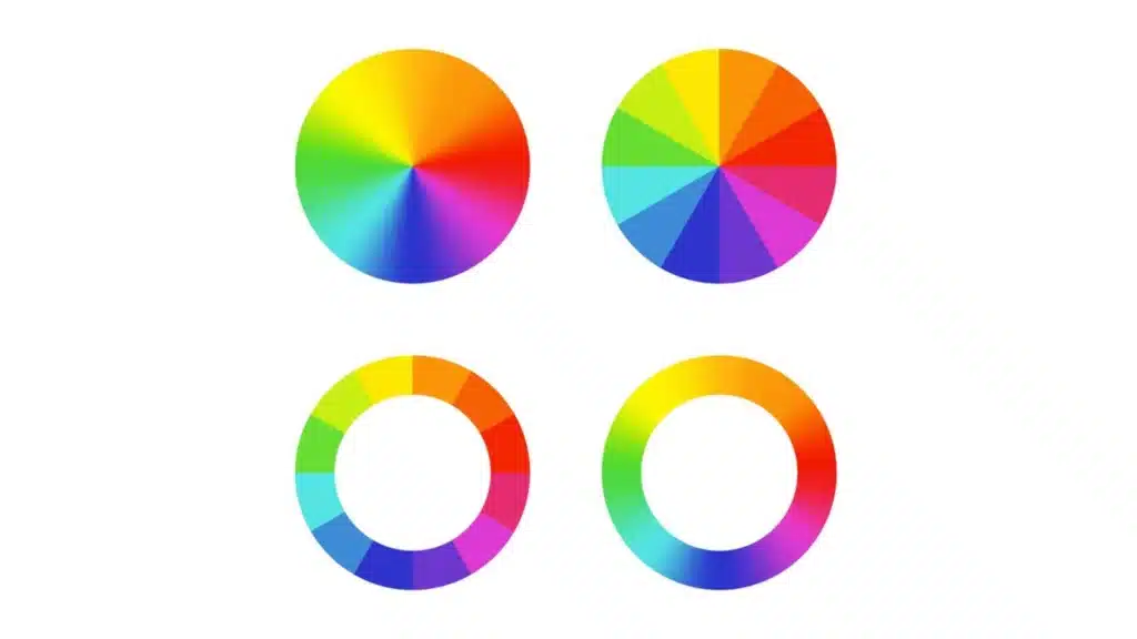
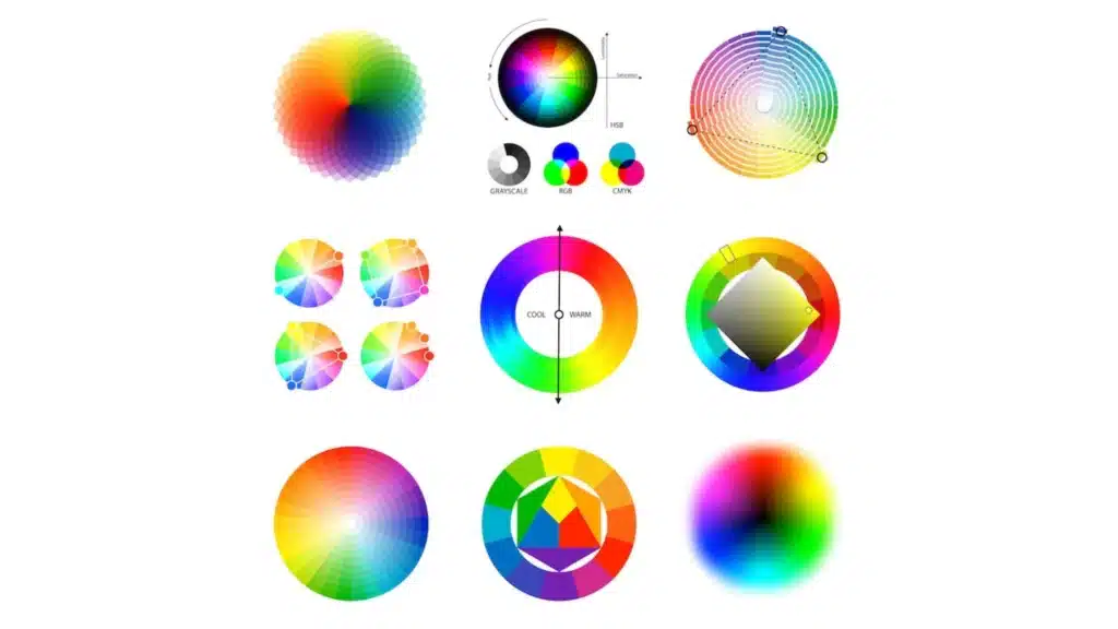
A color ring is an intuitive tool that shows color harmony, contrast, and transitions in a circular form. Unlike flat palettes, it offers a full view of how colors relate and interact, perfect for UI/UX design where flow and consistency matter.
How Color Rings Differ From Traditional Palettes
Beyond Color Wheels: Dynamic Rings in UI Tools
The color ring is not just a design theory, it’s a functional part of modern tools like Figma and Adobe XD, where rings adapt in real time as you design.
Color Rings as Decision-Making Aids
They help you make quick choices, want calm and consistent? Go for neighboring shades. Need impact? Jump across the ring for contrast. It’s visual logic made easy.
The Psychological and Functional Role of Color
Color Associations and Interface Behavior
Colors evoke emotion. Soft greens suggest relaxation. Bold reds indicate urgency. Using a ring helps organize colors not just by type, but by emotional weight.
How Color Affects Perceived Usability
A cluttered UI full of loud hues overwhelms. A muted, balanced ring-based palette creates ease. It’s about how users feel when they interact, and color plays the starring role.
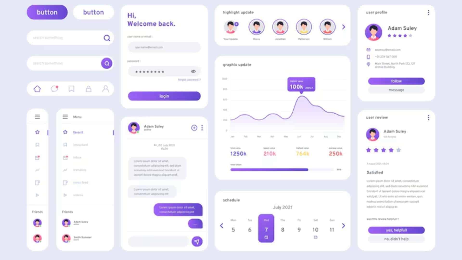
Building Color Rings for UI Projects
Starting with a Base Brand Color
Begin with your primary brand color and build around it. The ring shows where to move, left for harmony, right for contrast, inward for subtler tones.
Creating Harmony: Adjacent and Balanced Shades
Design with adjacent colors (also called neighbors) to create visual unity. They’re ideal for background sections, navigation, or dashboards.
Adapting Shades for Contrast and Clarity
Contrast is important for readability. The ring lets you preview how different values of a hue work together before applying them on live designs.
Improving UX Through Color Ring Strategies
Guiding the User’s Eye with Intentional Color Placement
Use color strategically. Want users to click a button? Choose a high-energy tone that pops from the rest of the ring. Want calm? Choose a desaturated neighbor.
Softening or Highlighting with Tone Adjustments
Within the ring, tones can be deepened or lightened to match context, think alert vs. background cards.
Color feedback (like green for success or red for error) can be derived directly from the ring, keeping the palette consistent and purposeful.
Accessibility Through the Lens of Color Rings
Creating Inclusive Color Strategies
With color rings, you can plan palettes that remain readable and understandable, even for users with vision limitations.
Simulating Visual Impairments and Adjusting Rings
Many tools now offer preview filters for color blindness. These help refine the ring to eliminate confusing combos.
Ensuring Readability with Proper Contrast Ratios
Tools like WCAG contrast checkers integrate with color ring tools, giving live feedback on text/background combos.
Digital Tools for Crafting and Testing Color Rings
UI Design Plugins and Standalone Tools
ColorBox for gradient ring generation
Huetone for color accessibility checks
Adobe Color and Coolors for complete palettes
Real-Time Color Ring Previews in Design Software
Figma and Sketch plugins allow color ring manipulation directly on interface elements, super helpful for quick iterations.
Exporting Ring-Based Palettes for Consistency
Once finalized, export hex/RGB values to design systems and keep brand visuals in sync across web and mobile.
Color Rings in Action: Use Cases
Designing for Light and Dark Modes
Use the ring to design both themes from the same palette, just adjust the brightness and keep hues consistent for familiarity.
Responsive Interfaces and Mood-Based Themes
Create mood boards based on the emotional goals of a project (e.g., bold, calm, fun) and pull ring shades accordingly.
Interactive UI Elements Enhanced by Color Shifts
Hover states, button clicks, and progress indicators can change color slightly based on ring gradients, small touches, big difference.
Common Missteps When Using Color Rings
Overusing Bright Tones Without Purpose
Too many saturated shades compete for attention. Use the ring to balance intense tones with softer, supporting colors.
Ignoring How Color Translates Across Devices
Colors appear differently on screens. Test color ring schemes on various displays to avoid poor contrast or hue shifts.
Neglecting User Testing for Visual Hierarchy
Just because it looks good doesn’t mean it works. Always A/B test to confirm color choices support usability.
Final Thoughts
Color rings are not just theory, they’re practical, creative tools that empower you to design better, smarter, and more consistently. By learning how to build and apply them properly, you’ll create interfaces that not only look amazing but feel right too.
Whether you’re refining a single screen or building a full system, the color ring can be your most reliable guide.
FAQs
Is a color ring the same as a color wheel?
Not exactly. A color ring is often interactive and applied in digital UI tools, while a wheel is usually a static print or concept reference.
Can a color ring improve user engagement?
Yes, when used to guide CTA design and highlight hierarchy, it can improve user flow and interactions.
How do I build a color ring from scratch?
Start with a base color (often your brand color), then map out neighbors, opposites, and neutrals, adjusting brightness and contrast as needed.
Should I use the same color ring for web and mobile?
Ideally, yes, with minor tweaks for screen differences. Consistency helps recognition across platforms.
What’s a quick rule for choosing colors from a ring?
Use the 60-30-10 rule: 60% primary, 30% secondary, 10% accent, from your ring setup.